
Walking through a busy street in London, many potential customers turn to their mobiles to discover local restaurants or aesthetic clinics nearby. For small business owners, making sure your website delivers a seamless mobile experience is now essential if you want to compete in the digital age. By strengthening your mobile-friendly website design, you can attract more visitors and convert searches into real bookings—especially as mobile performance now directly influences both search rankings and customer engagement.
Table of Contents
- Defining Mobile Optimisation For Small Businesses
- Core Elements Of An Effective Mobile Site
- Types Of Mobile Optimisation Strategies
- How Mobile Optimisation Impacts Bookings And SEO
- Common Pitfalls And How To Avoid Them
Key Takeaways
| Point | Details |
|---|---|
| Mobile Optimisation is Essential | For small businesses in London, mobile optimisation is crucial for improving customer engagement and conversion rates. |
| Focus on User Experience | Prioritising intuitive design and fast loading times significantly enhances user satisfaction and retention. |
| Regular Performance Audits | Conducting frequent assessments using tools like Google’s Mobile-Friendly Test helps identify and rectify potential issues. |
| Understand SEO Impact | Mobile-friendly websites are favoured by search engines, directly influencing visibility and customer bookings. |
Defining Mobile Optimisation for Small Businesses
Mobile optimisation represents the strategic process of adapting digital platforms to deliver seamless, high-performance experiences across mobile devices. For London’s small businesses, this approach goes beyond simple website resizing – it’s about creating intelligent, responsive interfaces that engage customers instantly.
The digital economy demands mobile readiness for SMEs, transforming how businesses interact with potential customers. In practice, mobile optimisation involves several critical technical and design considerations:
- Responsive design that adapts to different screen sizes
- Fast loading speeds on mobile networks
- Touch-friendly navigation interfaces
- Simplified content hierarchy
- Optimised image and media compression
Small businesses in London particularly benefit from mobile optimisation, as urban consumers predominantly use smartphones for searching local services. Research from the Enterprise Research Centre highlights that mobile-friendly websites can significantly improve customer engagement and conversion rates.
Understanding mobile optimisation means recognising it’s not just about appearance, but about creating a frictionless digital experience. This involves technical elements like:
- Implementing responsive CSS frameworks
- Using mobile-first design principles
- Compressing multimedia content
- Ensuring fast server response times
- Creating touch-friendly interface elements
Mobile performance directly correlates with user experience and search engine rankings. Google’s algorithms now prioritise mobile-friendly websites, making optimisation crucial for digital visibility.
Mobile optimisation is no longer optional – it’s a fundamental requirement for business survival in the digital marketplace.
Pro tip: Regularly test your website’s mobile performance using free tools like Google’s Mobile-Friendly Test to identify and resolve potential user experience barriers.

Core Elements of an Effective Mobile Site
Creating an effective mobile site requires a strategic approach that goes far beyond simply shrinking desktop content. Mobile design principles emphasise creating intelligent, user-centric experiences tailored specifically to mobile interactions.
The fundamental core elements of a successful mobile site include:
- Responsive design that adapts seamlessly across devices
- Intuitive, touch-friendly navigation
- Compressed, fast-loading multimedia content
- Simplified information architecture
- Legible typography optimised for smaller screens
- Prioritised critical user pathways
Technical considerations play a crucial role in mobile site effectiveness. Performance optimization becomes paramount, with loading speed directly impacting user engagement and search engine rankings. Mobile sites must deliver content rapidly, typically within 2-3 seconds, to prevent user abandonment.
Navigation design requires particular attention for mobile platforms. Users expect:
- Clear, prominent menu structures
- Minimal clicks to access key information3. Finger-friendly button sizes
- Contextual search functionality
- Streamlined form design
User experience represents the critical differentiator between average and exceptional mobile sites. Intelligent design anticipates user needs, reducing cognitive load and simplifying interaction pathways.
Mobile sites are not just smaller websites – they are entirely different digital experiences requiring unique design philosophies.
Pro tip: Conduct regular mobile usability testing, using real devices and diverse user demographics to identify and resolve potential navigation or performance barriers.
Types of Mobile Optimisation Strategies
Mobile optimisation strategies represent a critical toolkit for small businesses seeking to enhance their digital presence. Mobile marketing optimization tactics provide London SMEs with multiple approaches to improve their digital performance and customer engagement.
Key mobile optimisation strategies include:
- Responsive web design
- Progressive web applications (PWAs)
- Accelerated mobile pages (AMP)
- Native mobile application development
- Cross-platform mobile solutions
- Platform-specific user interface adaptations
Security considerations play a fundamental role in mobile optimisation. Small businesses must prioritise protecting customer data and maintaining robust digital infrastructure. This involves implementing multiple layers of protection across mobile platforms.
The primary categories of mobile optimisation strategies can be further broken down:
- Design-focused strategies
- Performance-based optimization
- Security-driven approaches
- User experience enhancement
- Analytics and continuous improvement
Technical adaptability becomes crucial for businesses navigating the complex mobile ecosystem. Each strategy requires careful implementation, considering the specific needs of the target audience and the unique characteristics of different mobile platforms.
Here’s a concise comparison of leading mobile optimisation strategies for small businesses in London:
| Optimisation Strategy | Distinct Benefit | Implementation Challenge | Ideal Use Case |
|---|---|---|---|
| Responsive Web Design | Seamless device compatibility | Requires continual testing | Service and retail SMEs |
| Progressive Web Applications | Offline access and engagement | Development can be complex | Businesses with frequent repeat use |
| Accelerated Mobile Pages | Ultra-fast load times | Limited layout flexibility | News, blogs, info portals |
| Native Mobile Application | Best device functionality | High upfront investment | Brands seeking custom experiences |
| Cross-platform Mobile Solution | Wider market coverage | Possible performance trade-offs | SMEs serving varied audiences |
Mobile optimization is not a one-size-fits-all solution but a dynamic, evolving approach to digital engagement.
Pro tip: Regularly audit your mobile platforms using comprehensive testing tools to identify potential performance, security, and user experience gaps.
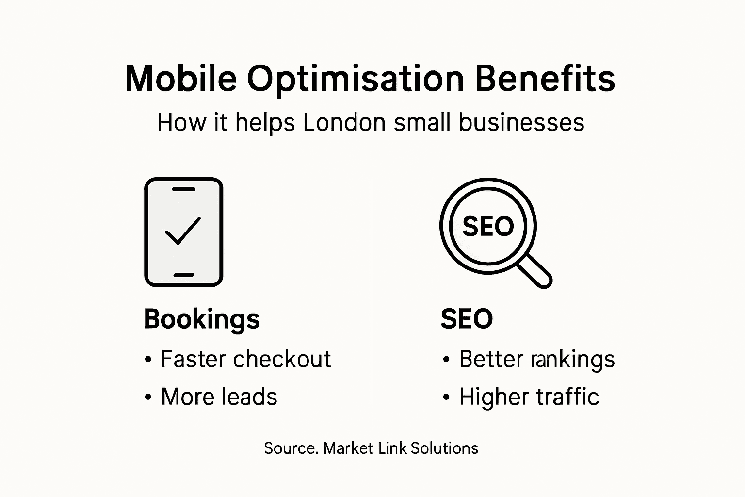
How Mobile Optimisation Impacts Bookings and SEO
Mobile optimisation has become a critical factor in determining a small business’s digital success, particularly in competitive urban markets like London. Search engine optimization strategies directly correlate with mobile performance, influencing both online visibility and customer booking rates.
The key impacts of mobile optimisation on bookings and SEO include:
- Improved search engine rankings
- Enhanced user experience
- Faster page loading speeds
- Higher conversion rates
- Increased mobile traffic
- Better local search visibility
Search ranking algorithms now prioritise mobile-friendly websites, making optimisation crucial for London SMEs seeking to attract local customers. Businesses that neglect mobile responsiveness risk significant drops in online visibility and potential customer engagement.
The direct relationship between mobile optimisation and booking performance can be understood through several critical metrics:
- Reduced bounce rates
- Increased time on site
- Simplified booking interfaces
- Quicker customer decision-making
- Seamless cross-device experiences
Conversion potential dramatically improves when businesses create mobile-optimised booking platforms. Customers expect intuitive, fast-loading interfaces that allow them to make appointments or purchases with minimal friction.
The following table summarises the measurable impacts of mobile optimisation on bookings and SEO for London SMEs:
| Metric Improved | Direct Effect on Bookings | SEO Impact |
|---|---|---|
| Loading Speed | Faster checkouts | Higher Google rankings |
| Mobile Navigation | Easier appointment setting | Longer visitor duration |
| Conversion Interface | Increased purchase rate | Lower bounce rate |
| Cross-device Consistency | Seamless customer journey | Enhanced local search |
Mobile optimization is no longer a luxury – it’s a fundamental requirement for business survival in the digital marketplace.
Pro tip: Conduct monthly mobile performance audits using free tools like Google’s Mobile-Friendly Test to identify and rapidly address potential optimization gaps.
Common Pitfalls and How to Avoid Them
Mobile optimisation presents numerous challenges for London’s small businesses, requiring strategic awareness and proactive management. Mobile application performance challenges highlight critical areas where SMEs frequently encounter difficulties in their digital transformation journey.
The most prevalent mobile optimisation pitfalls include:
- Overloading websites with excessive features
- Neglecting page loading speed
- Ignoring cross-device compatibility
- Poor user interface design
- Inadequate security protocols
- Inconsistent mobile experience
Technical complexity often overwhelms small business owners, leading to suboptimal mobile strategies. Understanding these common pitfalls becomes crucial for creating effective, user-friendly mobile platforms that drive customer engagement and business growth.
Specific challenges that demand immediate attention include:
- Slow page loading times
- Non-responsive design elements
- Complicated navigation structures
- Insufficient mobile-specific content
- Weak security infrastructure
User experience degradation can occur rapidly when businesses fail to address fundamental mobile optimisation requirements. The consequences extend beyond mere inconvenience, potentially resulting in significant loss of potential customer interactions and reduced search engine visibility.
Mobile optimization requires continuous learning and adaptation, not a one-time solution.
Pro tip: Conduct quarterly comprehensive mobile performance and security audits to systematically identify and resolve potential optimization challenges.
Unlock the Full Potential of Mobile Optimisation for Your London Small Business
Mobile optimisation is essential for small businesses in London that want to stand out and convert visitors into loyal customers. The article highlights the challenges such as slow loading speeds, poor user experience, and ineffective navigation that harm your website’s performance and SEO rankings. At Market Link Solutions, we understand the critical importance of creating fast, responsive, and intuitive mobile websites that truly engage your target audience with tailored Web Design and Development, SEO optimisation, and focused PPC Advertising on Google and Instagram.
Take inspiration from our Success Stories Archives – Digital Marketing Agency – Market Link Solutions to see how we have transformed mobile experiences for London SMEs by boosting conversions and local search visibility. Don’t let outdated mobile platforms hold your business back from growth opportunities. 
Ready to elevate your mobile presence and win more bookings? Visit Market Link Solutions now to discover how our expert team can build you a mobile-optimised website paired with effective digital marketing strategies designed specifically for London’s competitive market. Start your journey to seamless mobile success today and connect with customers exactly when it matters most.
Frequently Asked Questions
What is mobile optimisation?
Mobile optimisation is the process of adapting digital platforms to provide seamless and high-performance experiences on mobile devices. It includes responsive design, fast loading speeds, touch-friendly navigation, and optimised content.
Why is mobile optimisation important for small businesses?
Mobile optimisation is crucial for small businesses as it enhances user experience, improves search engine rankings, and increases conversion rates. With many consumers using smartphones to search for local services, a mobile-friendly site can significantly boost engagement.
How does mobile optimisation affect search engine rankings?
Mobile optimisation impacts search engine rankings by ensuring that websites are mobile-friendly. With Google’s algorithms prioritising mobile-friendly sites, proper optimisation can lead to improved visibility in search results, attracting more potential customers.
What common pitfalls should small businesses avoid in mobile optimisation?
Common pitfalls include overloading websites with excessive features, neglecting page loading speed, ignoring cross-device compatibility, poor user interface design, and inadequate security protocols. Addressing these issues is essential for creating effective mobile platforms.
Recommended
- Web Design – Why It Matters for London SMEs
- SEO Optimisation – Why It Matters for London Businesses
- Mobile SEO – Digital Marketing Agency – Market Link Solutions
- Responsive Design: Why It’s Crucial for Small Business Websites – Digital Marketing Agency – Market Link Solutions
- Online Marketing – trendymarketing | Deine Zukunft beginnt jetzt